GitHub

Your daily dose of AI slopware

A job tracker I directed into existence in 22 hours.

A spreadsheet can store job applications. This one also tells you what needs you today and what changed while you weren't looking. AI agents wrote the code. I decided what it should be and sent things back until it was.

  1. Wall clock22 hrs
  2. AI agents6
  3. Commits10
  4. Automated tests52
  5. Real companies0

Click around. Nothing here is real.

This is the actual app, running in your browser against a fake API. Every company is invented. Change whatever you like; it all resets when you reload.

  • Click a status badge
  • Open any row
  • Try the Flow button
  • Open Appearance and break the colors
  • Click inside, then press ?
Open full screen
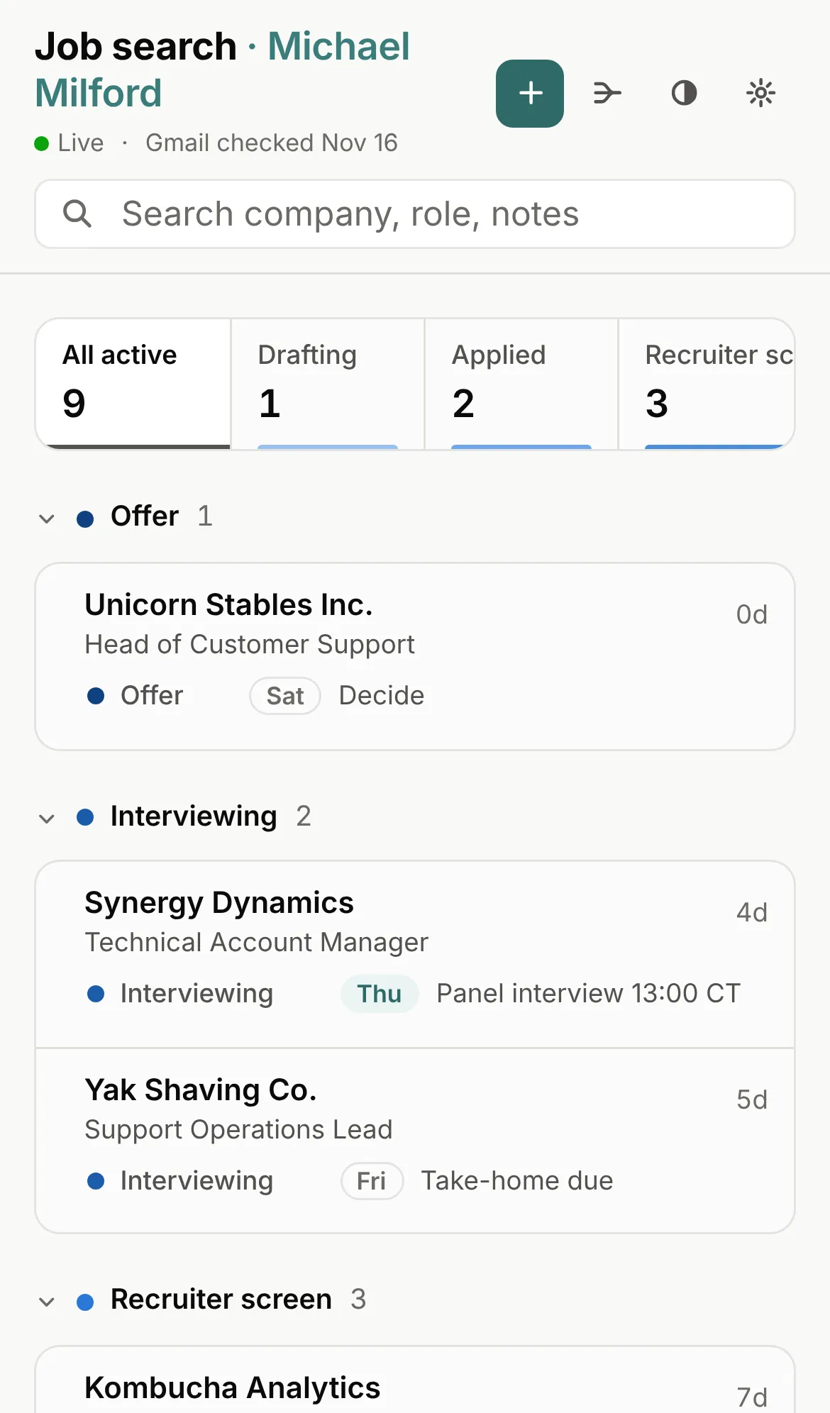
The tracker on a phone: the title and buttons on top, a search box, a scrolling stage strip, and applications as stacked cards grouped under Offer and Interviewing.

The demo works on phones. It just wants the whole screen to itself.

Open the demo

What it does

Short version: it tells you what to do next. Long version below, with screenshots of companies that don't exist.

Where things stand, then what changed

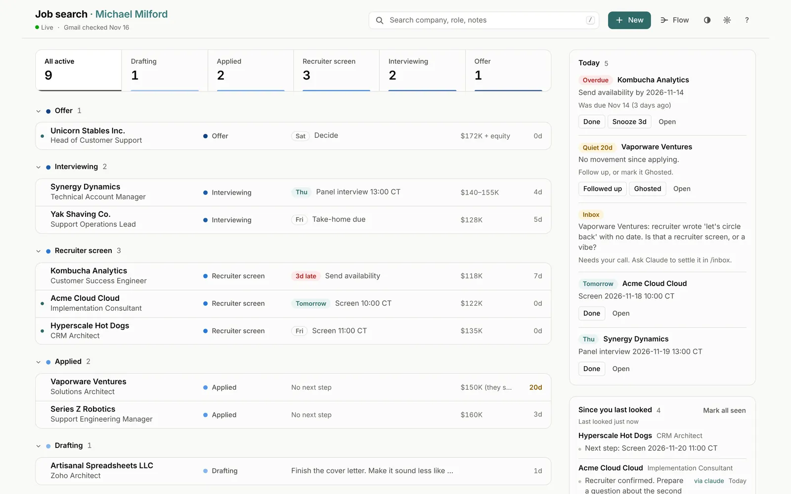
Version one worked. That was the problem. It had summary cards, a bar chart and a box called "Needs attention," all of it accurate, and I still had to read the whole page to find out what to do next. The redesign puts the stages across the top, groups applications by stage, and moves everything that needs me into a rail on the right.

The call Where things stand goes first. What changed overnight goes right after it.

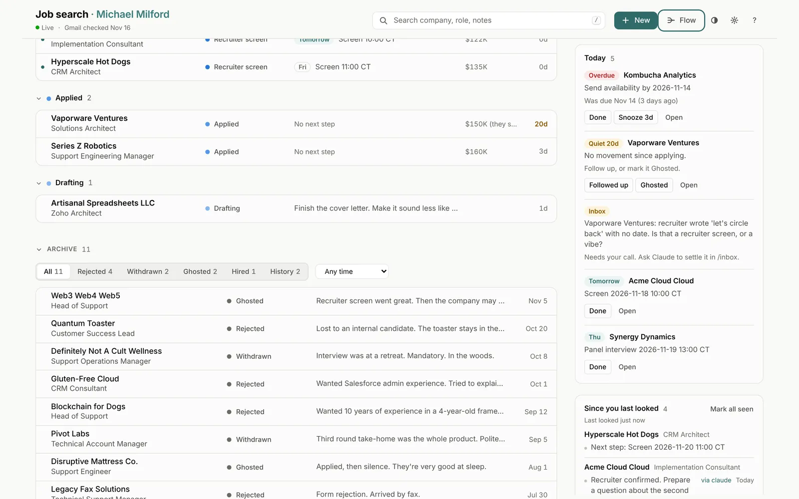
Today collects overdue next steps, anything quiet for 10+ days, and calls the email sync couldn't make on its own. Each one gets a button: Done, Snooze, Followed up, or Ghosted.

Since you last looked lists changes you didn't make yourself. Usually that means Claude, which reads my Gmail (read-only) and updates statuses when a rejection or an interview invite shows up. Every change it makes is signed on the timeline.
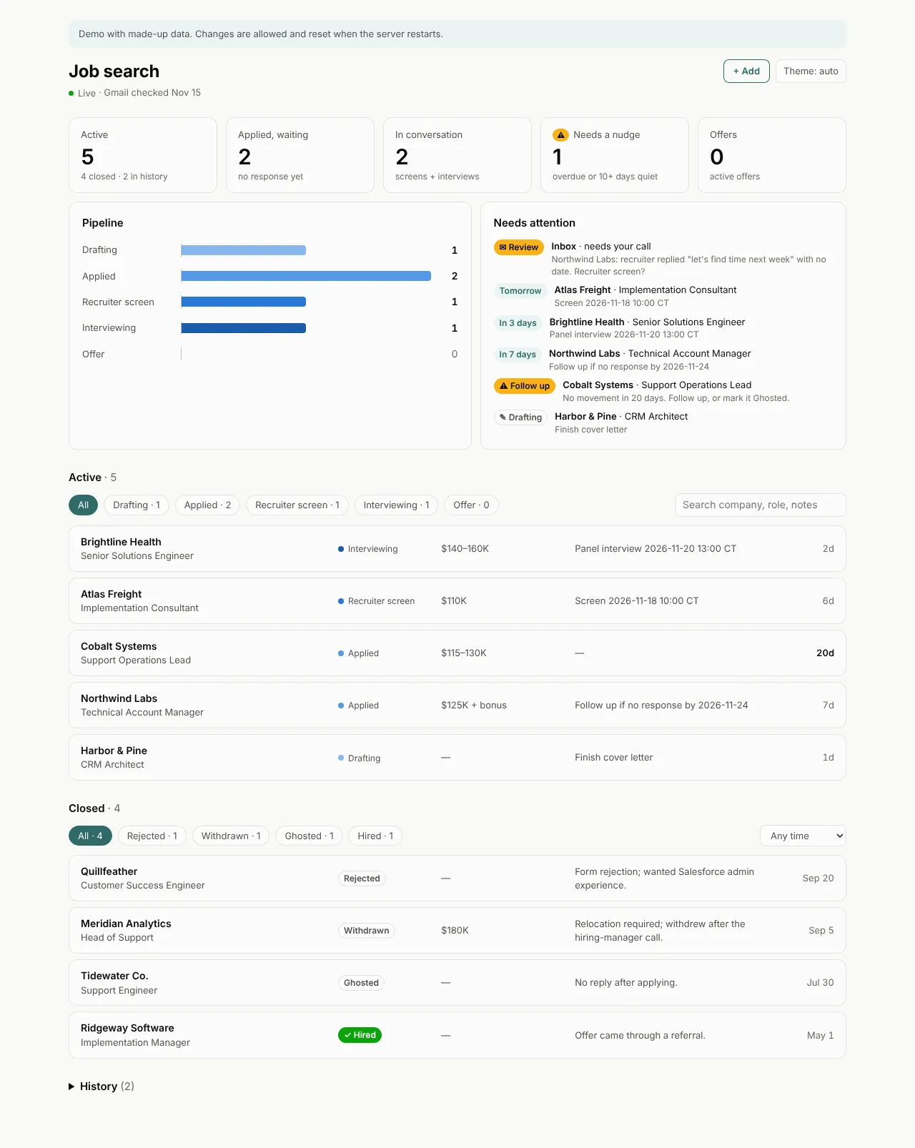
Before: the first version, with five summary cards, a pipeline bar chart, a Needs attention list, and plain tables of active and closed applications.
Before Correct and thorough. Read every word to find one task.
After: a stage strip with counts, applications grouped under Offer, Interviewing, Recruiter screen, Applied and Drafting, and a Today rail showing Kombucha Analytics overdue by three days, Vaporware Ventures quiet for 20 days, and an inbox question about whether 'let's circle back' counts as a recruiter screen.
After The overdue one is red, at the top, with a Done button. The inbox item wants to know whether "let's circle back" with no date counts as a recruiter screen. Reasonable question.

Update things without opening a form

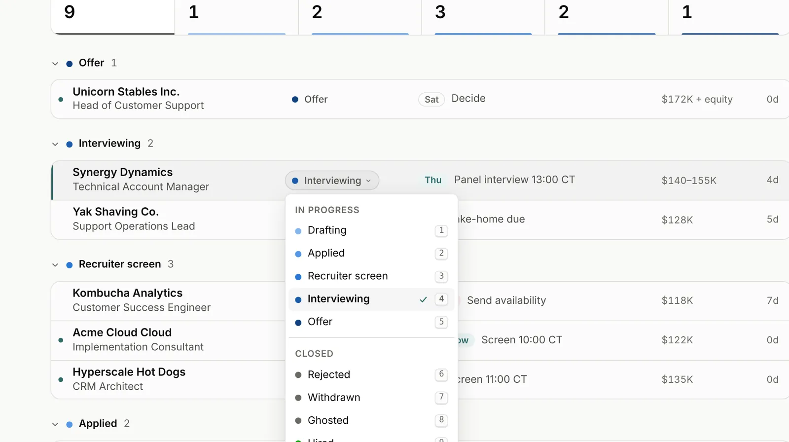
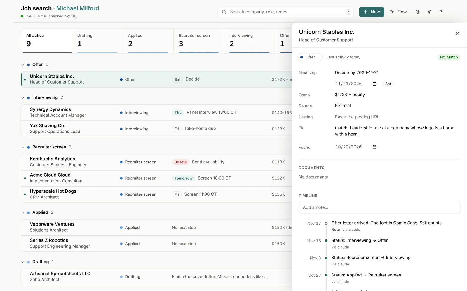
Click a row's status badge, pick the new stage. Two clicks. Open the row and a drawer slides in where every field edits in place: next step and date, comp, source, posting link, fit, notes. The timeline below records each change and who made it.

The status menu open on a row's badge, listing in-progress stages Drafting through Offer and closed outcomes Rejected, Withdrawn and Ghosted, each with a number key.
Click the badge, pick a stage. Rejected is number 6, for the muscle memory.
The detail drawer for Unicorn Stables Inc., Head of Customer Support, with editable fields and a timeline whose latest note, added via claude, reads: Offer letter arrived. The font is Comic Sans. Still counts.
The offer letter was in Comic Sans. The timeline notes it, and notes that Claude noticed.

An archive that remembers why

Closed applications move to the archive with a one-line lesson. Filter by outcome or time window, or search it along with everything else, notes included. The lessons are meant to be useful. Some of them are.

The archive with filters for Rejected, Withdrawn, Ghosted, Hired and History. Lessons include: Interview was at a retreat. Mandatory. In the woods. And: Applied, then silence. They're very good at sleep.
Definitely Not A Cult Wellness: "Interview was at a retreat. Mandatory. In the woods." Withdrawn.

A flow chart of your own attrition

The call Add a flow chart, in the middle of the build. Plans are allowed to change.

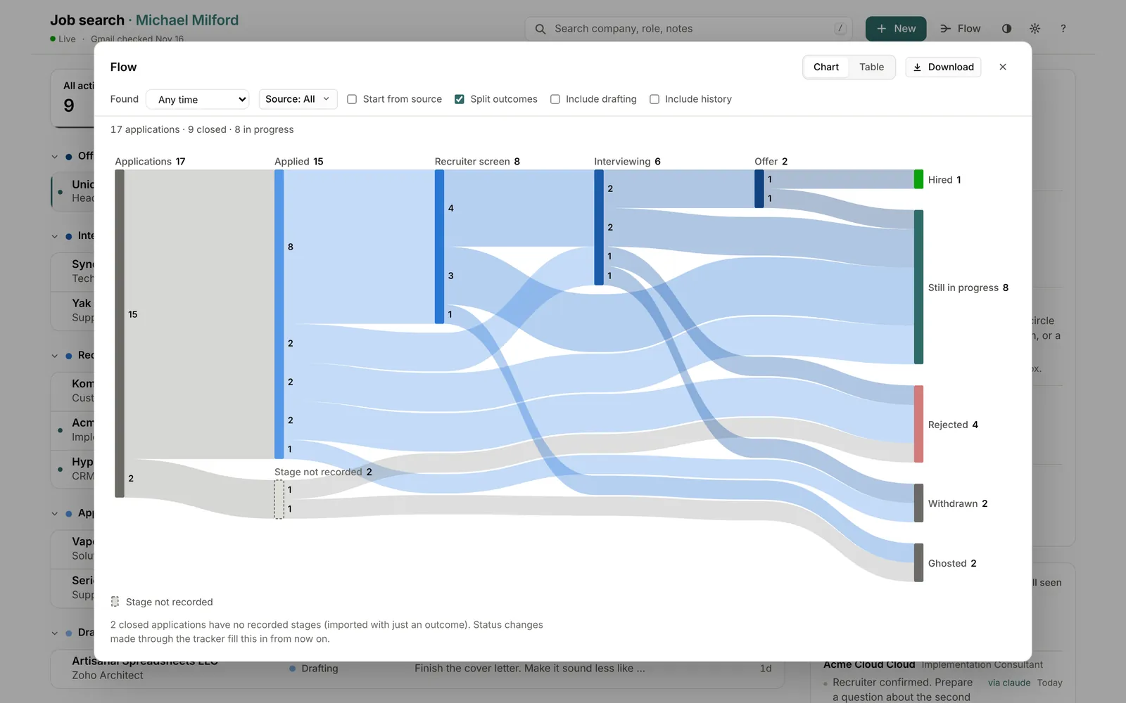
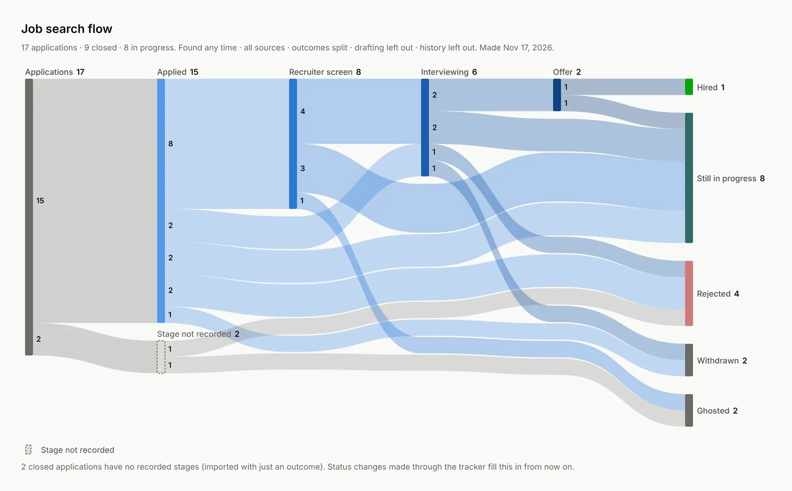
A Sankey chart of how applications moved through the stages to their outcomes. Filter it, flip to a table, download it as PNG or SVG. It only draws stages that were actually recorded. Applications imported with just an outcome show up as "Stage not recorded" instead of the chart making something up.

The Flow dialog: a Sankey chart from 17 applications through Applied, Recruiter screen, Interviewing and Offer to Hired, Still in progress, Rejected, Withdrawn and Ghosted, with filters and Chart, Table and Download buttons.
17 applications in, 1 hire out. The chart reports this without comment.
The downloaded chart image titled Job search flow, with a one-line summary of the filters used and a legend for Stage not recorded.
The download. Suitable for a slide, if your job search has slides.

Change every color. Regret some of them.

The call Keep the original colors as the default. Make all of them changeable.

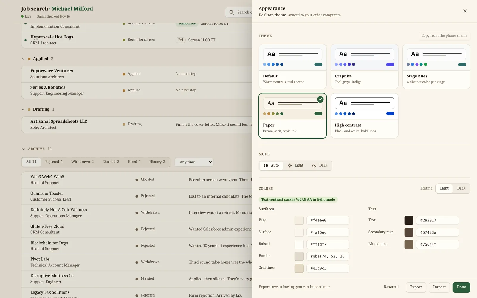
The Appearance panel has five themes: Default, Graphite, Stage hues, Paper and High contrast. Past that you control every color in light and dark, plus the font, size, density, corner radius and badge style. A contrast check tells you when you've gone too far.

Themes sync across devices: one for your computers and a separate one for your phone.

The Appearance panel with the Paper theme selected: cream background, serif type, theme cards for all five themes, and color fields with a note that text contrast passes WCAG AA in light mode.
Paper: cream, serif, sepia ink. For the job seeker who owns a fountain pen.
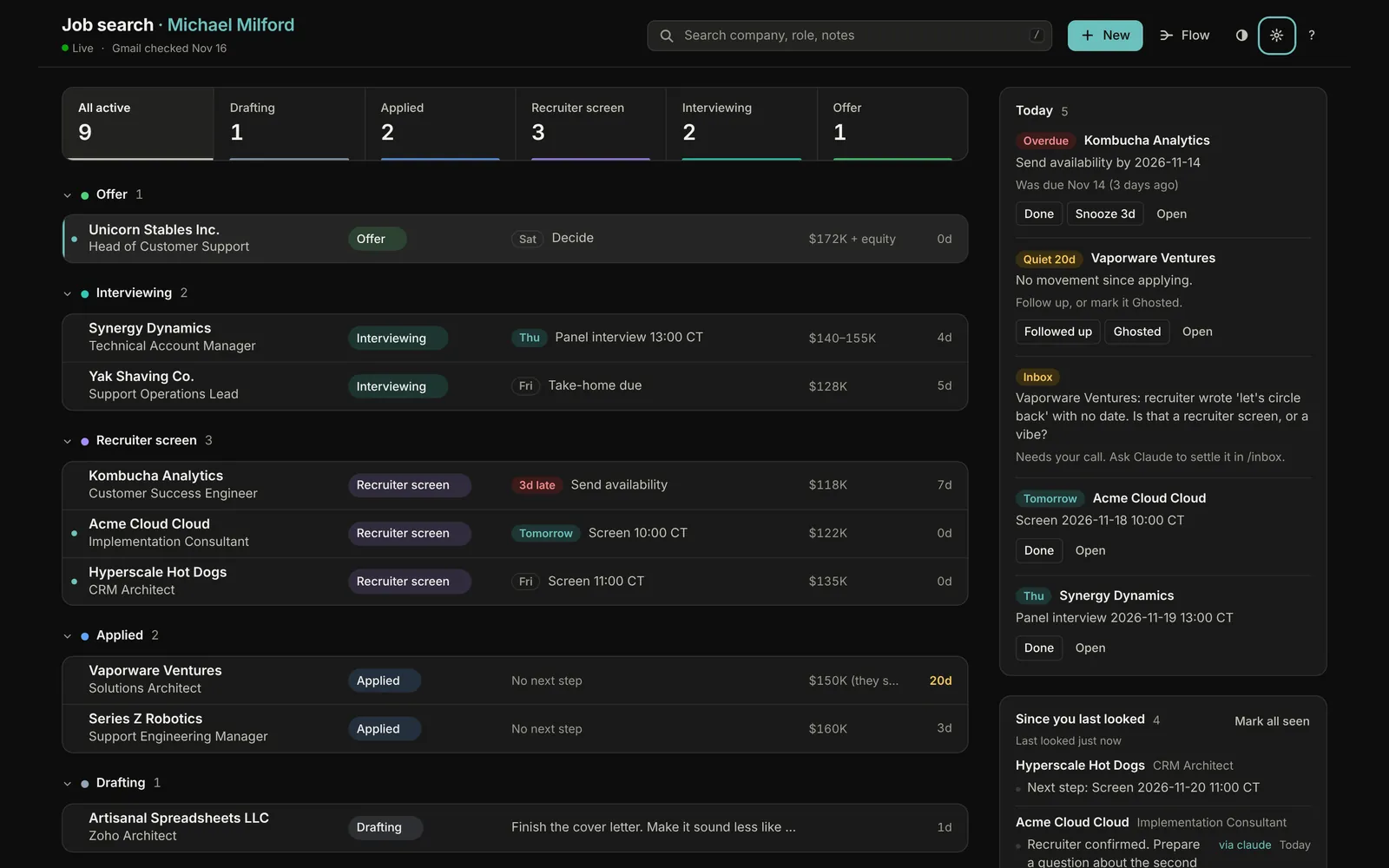
The main view in dark mode with the Stage hues theme, giving each stage its own color, and filled pill badges for each status.
Dark mode, Stage hues theme, filled badges. Someone's idea of a good time.

Keyboard first, phone second

The call Desktop first. The phone layout came after, and it works.

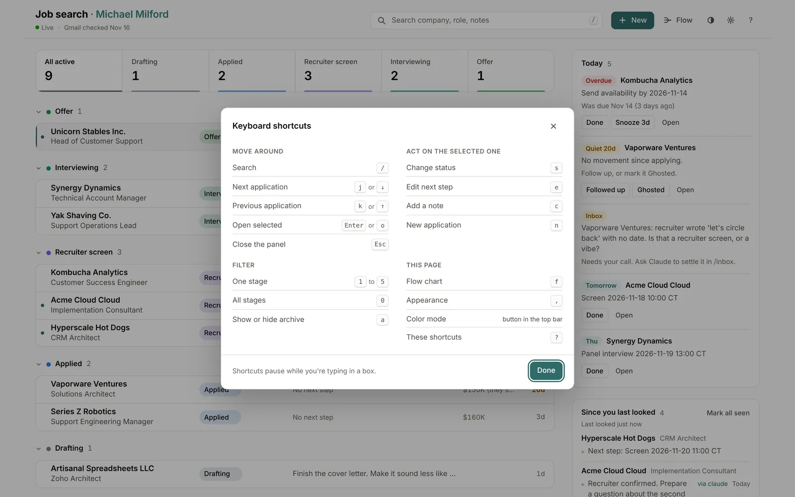
j and k move between applications, s changes status, n adds one, f opens the flow chart, and ? lists the rest. On a phone the same page folds into stacked cards.

The keyboard shortcuts dialog, grouped into Move around, Act on the selected one, Filter, and This page.
Press ?. For people who treat the mouse as a fallback.
The phone layout: stacked application cards under Offer and Interviewing, with a horizontally scrolling stage strip.
Same data, fewer columns.

How it got built

I didn't write this code. I directed six AI agents in Claude Code: a lead, an advisor model, and four builders working in parallel on the list and Today rail, the detail drawer, the theme editor and shortcuts, and the flow chart. I was the product owner. I decided what it was for and made the calls on layout, workflow and customization. I reviewed every screen and decided when it shipped.

  1. First commit.
  2. Redesign live.
  3. About 22 hourson the wall clock. I'm not saying how many of them I slept.

What I decided

  • The problem. Storing applications is solved; a spreadsheet does it. What's worth building is the presentation, the UX and the customization.
  • The order. Where things stand comes first. What changed overnight comes second.
  • The screen. Desktop first, then a phone layout.
  • The look. Keep the original colors. Make every one of them customizable.
  • The sync. Themes sync per device class: one for computers, one for phones.
  • The surprise. A flow chart, added mid-build.
  • The finish line. Every layout, workflow and customization call, every screen reviewed, and when it shipped.

What the agents did

  • ~4,900lines of front end. Plain ES modules, no framework, no build step.
  • ~870lines of Python. FastAPI and SQLite.
  • 52automated tests.
  • 4builders at once, plus a lead and an advisor.

Also, every day after: Claude keeps the tracker current through its API, reading Gmail and logging each change on the timeline under its own name.

Run it yourself

Three levels of commitment. Pick the lowest one that answers your question.

1

Try it here

No steps. The demo is at the top of this page, running entirely in your browser.

Back to the demo

2

Run the demo locally

A few commands. You'll need Python 3.12 or newer and git. Demo mode uses made-up data that resets when you stop it.

  1. git clone https://github.com/mnmilford/job-tracker.git
  2. cd job-tracker
  3. python3 -m venv .venv
  4. .venv/bin/pip install -r requirements.txt
  5. DEMO_MODE=1 .venv/bin/uvicorn app.main:app --port 8300

Then open http://127.0.0.1:8300. Stop it with Ctrl+C.

Fine print

Will you fix bugs or add features?

No. This is a portfolio piece. If it breaks, you get to keep both pieces. If you want a feature, fork it. The same AI agents are available to you, and they don't mind being sent back.

Is any of the data real?

None of it. Blockchain for Dogs, Unicorn Stables Inc., Kombucha Analytics and Synergy Dynamics are invented, and so is everyone else in the demo and the screenshots. My real job search lives in a database on my own server and stays there.

Why not just use a spreadsheet?

You can. Before this I used a markdown table, which stored everything fine. It just never told me what to do next.

Did AI really write all of it?

Yes. It's in the title. I defined the problem, made the calls on layout and workflow, reviewed every screen, and decided when it shipped. Whether that makes it slopware is your call. The demo is right up there.

What's the license?

The code is public on GitHub. The repo doesn't include a license file.

Is there support?

There is this paragraph.